Credibility first: the system behind Ansarr
How the design system behind Ansarr works, what came from my earlier systems, and what was new.
Ansarr is a marketplace where researchers pay people to take part in their studies. A researcher creates and funds a study, educated respondents who match it answer on their phones, and they get paid in naira. I designed and built it, and it is coming to Google Play and the App Store.
Money moves between strangers here, so one rule led the design: credibility first, warmth second. Most of the interface stays flat and quiet, which also keeps it quick on a low-end Android phone.
Underneath is a design system of 27 components, 43 icons, 56 text styles and 97 colour variables. It started as a Claude design project in June 2026, moved into code the same month, and has been refined in Figma since. What follows is what that system made cheap, and the one place it broke all at once.
What came with me
Ansarr was my fourth design system, after Meerakl, Luciana and Atelier, so some things were in place before any component existed.
The tokens have three tiers. Primitives hold raw values: the violet ramp, the greys. A semantic tier names roles: text, icon, background and border. A component tier maps those roles onto parts like the button, input, card and wallet, and the components read from it. Dark mode is a swap of token values, not a second set of styles. Line heights sit on a 4px grid. I also left Tailwind's own spacing scale alone, because renaming it had broken layouts for me before.
Other parts were new because Ansarr asked for them. There is a colour family just for earnings. The type scale is a major third on a 16px base, from Display at 49px through Body at 16px down to Caption at 10px. Every icon is one swappable component, so an icon is a name, not a drawing. Components are plain CSS classes with thin React wrappers over them.
One decision in June
In June 2026 the product's name changed from Narrova to Ansarr, and a new identity came with it. That was the one decision. The system changes followed from it.
The primary colour moved from a deep indigo to an electric violet, #6935F0. The accent moved from amber to fuchsia, #EC4899, and it is decorative: badges and highlights. Warning stayed amber. Three typefaces (Schibsted Grotesk, Inter and IBM Plex) gave way to Geist, one variable font for every role, with tabular figures wherever amounts need to line up.
Because the tokens were the source of truth, most of the recolour was a rename. The indigo ramp became a violet ramp, re-anchored at step 600, and everything that pointed at it followed. Most, not all. Nine dark-mode colours were missed and still pointed at the old palette until a later pass caught them. In that same pass the old background and border names in Figma were retired, and 218 bindings moved onto the new role names without a single value changing.
Two greens
Ansarr has two greens. Earnings green, #0F7040, is for money: the wallet, payouts and approvals. Success green, #25A465, is the system's success colour, and it is the colour of the matching livebar.
The livebar sits on a live study: a row of thin vertical bars. While the study has no responses, a green fill sweeps across the bars, snaps back and sweeps again. Still matching. The first response stops the sweep and turns the row into a progress bar, filled to responses over target. An earlier version bounced the bars up and down like an equaliser. I dropped it for the sweep.
Matching is live, and it can need the researcher to act, so they need to see how their study is being responded to. That is why the livebar uses success green and not earnings green. Respondents see the same bars on their study cards, as a plain fill with no sweep. Earnings green also appears next to the livebar, on the study's reward, and that was not on purpose.
Colour is not the whole signal either. Alerts carry a coloured bar down their left edge, and full-size alerts add a short uppercase label, so their meaning never rests on colour alone.
One app, two sides
Researchers and respondents use the same app. A link on the Profile tab connects you to the other side. Nothing was forced apart: it is one app. The researcher's workspace and the respondent's feed use the same card component. The Figma file keeps two groups of screens, Seek Ansarr for researchers and Give Ansarr for respondents, and both draw on the same components.
Light and dark work the same way. Every signed-in screen follows the phone's setting, and the public pages stay light. In Figma a dark screen is the light frame with its colour mode switched. In dark mode the violet lightens to #8C5FF4, and the primary button's text stays white.
One picker
Android's own dropdown opens the system list, full width with radio dots. I didn't like it. Now every choice in Ansarr opens the same bottom sheet. You can drag it down to dismiss it, feel a short vibration when you pick, and close it with Android's back button. Past 12 options it grows a search box, which is how you find your bank in a list of Nigeria's banks. The Select component kept its props and became a thin wrapper around the sheet, so about 14 places in the app changed without being edited.
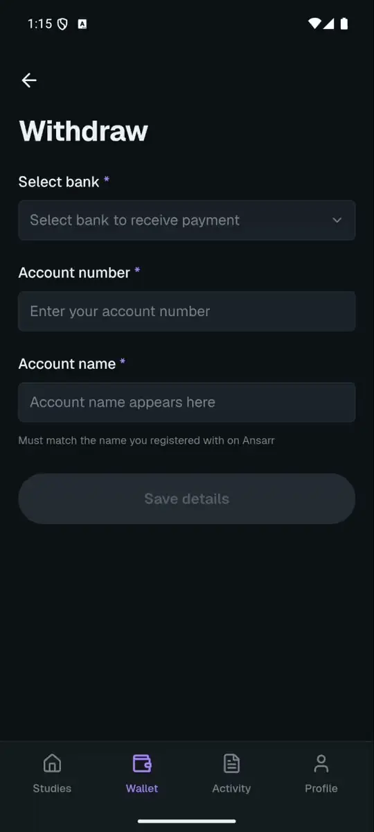
I wanted one picker because a choice should look and behave the same on every screen, and because the Android list did not look like Ansarr.
Then it broke, everywhere at once. The sheet wrote each choice into a hidden form field, and React reset that field to empty whenever the sheet re-rendered. The pick never reached the form, so it saved as nothing. It first showed up as respondent onboarding forgetting a person's gender, but it had hit every picker in the app. The fix was in one component.
That is the trade a shared component makes. Doing both jobs meant I owned both halves of it: the decision that made every picker the same, and the bug that made every picker fail. One place to get it wrong is also one place to fix it, and for an app that moves money between strangers, that is the deal I want.